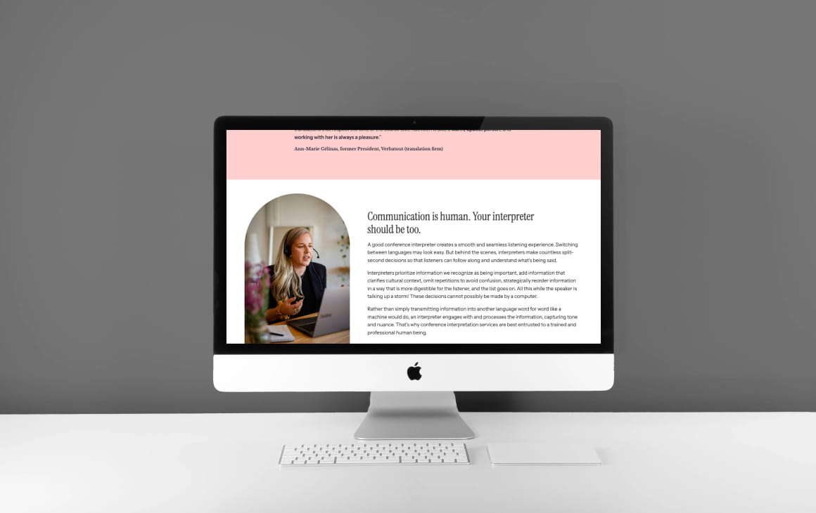
It was super important for Kathleen that her design to feel organic and natural, while also demonstrating her professional expertise. I implemented this in the lines of her logo, typography choices and layout of her site. I used contrasting colours that felt welcoming and used a tall serif paired with a clean sans to insure a polished and professional, almost editorial look.
VIEW LIVE SITEIt was super important for Kathleen that her design to feel organic and natural, while also demonstrating her professional expertise. I implemented this in the lines of her logo, typography choices and layout of her site. I used contrasting colours that felt welcoming and used a tall serif paired with a clean sans to insure a polished and professional, almost editorial look.

It was crucial to bring a natural, human touch to her website so that it would standout from generic language service sites and show how much dedication she puts into her project.Since she was a pro rugby athlete, we used this to highlight her abilities in the sectors of live event interpreting and sports, as well as her discipline, rigour and confidence which are assets in her linguistics career.
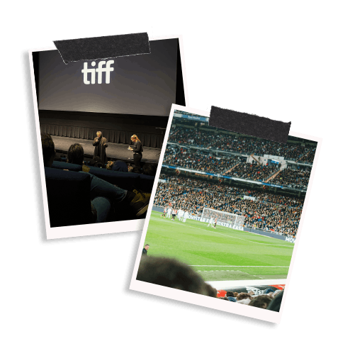
To get people to book you, they must quickly understand whether you offer the services you are looking for. With that in mind, I created dedicated sections for each of her offers, from simultaneous interpretation for big corporate conferences, webinars and educational events, to translation, to consecutive interpretation at press junkets, film festivals, and interviews.
I also put the spotlight on some of her well-known clients such as Tiff, Rio Tinto and Air Canada to build authority, alongside a testimonial section with real-world reviews.
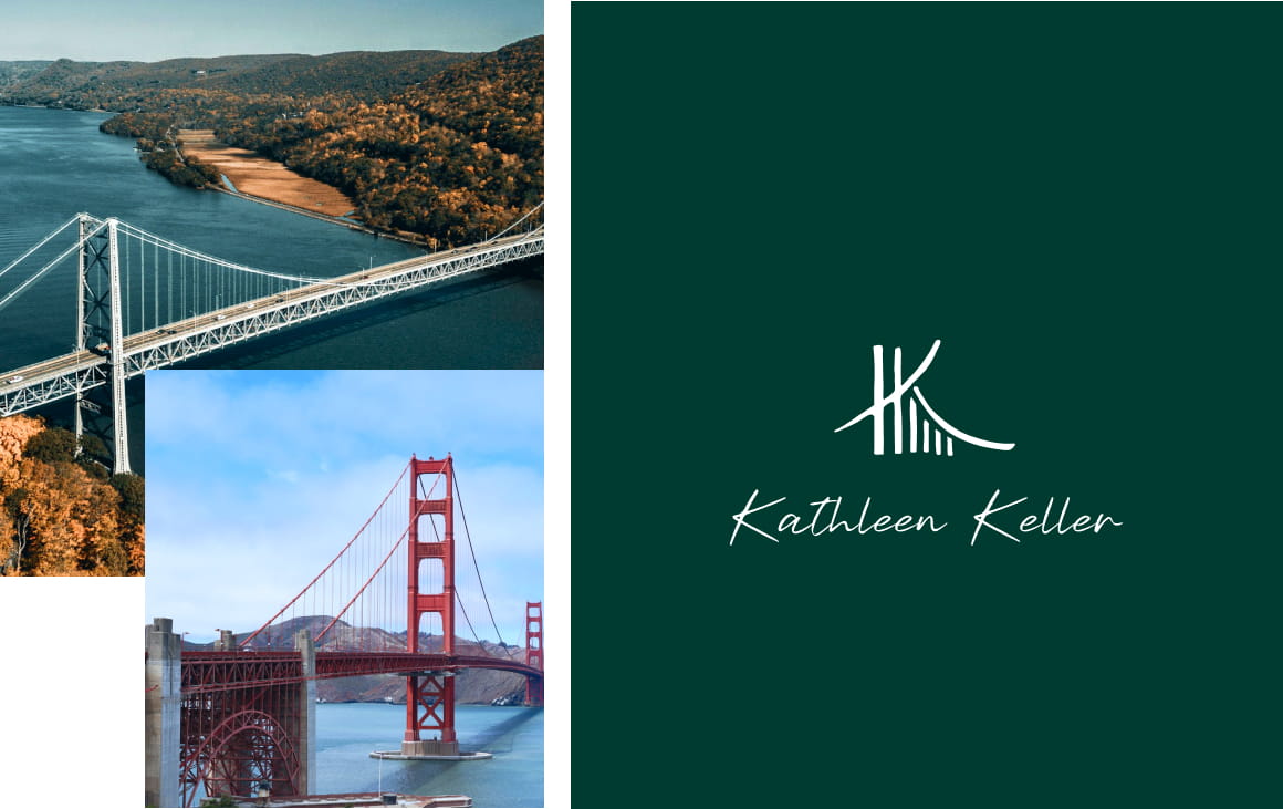
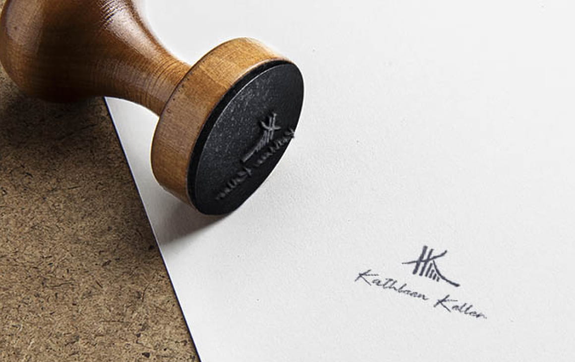
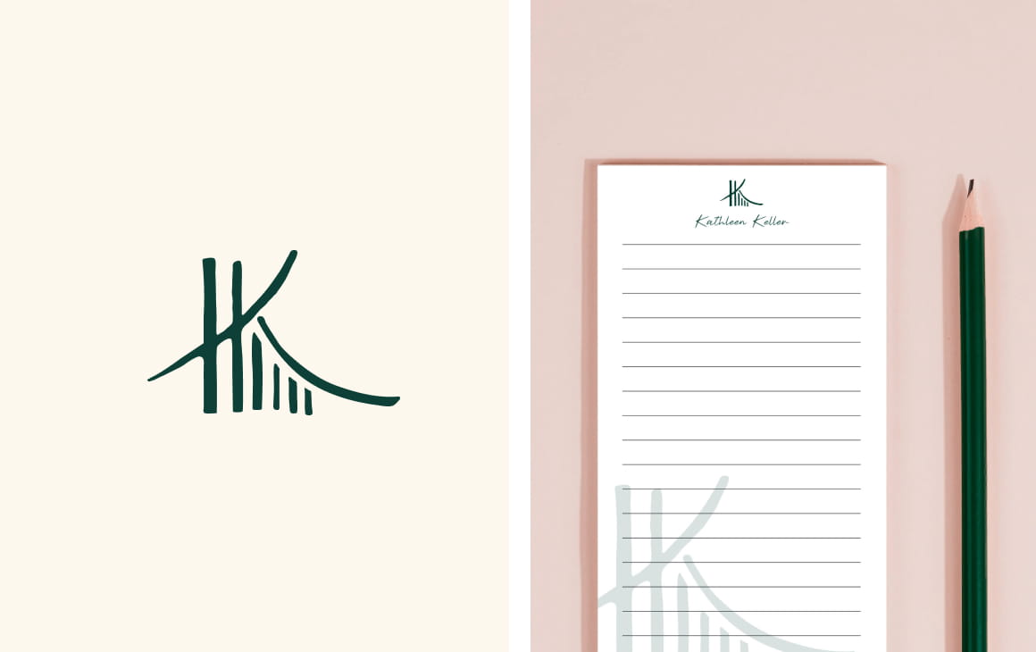
My client wanted to use the imagery of a suspension bridge to show thats she helps bridge communication gaps. After the first design round, she liked the concept but found that the lines were too stiff. I reworked on the concept while putting special attention to keeping the lines organic and hand drawn. The result is a logo that hold symbolism without being too on the nose and which also serves as monogram, nodding to her alliteration like name.